เวอร์ชันต้นแบบ รถ ผู้ให้บริการ และราคาเป็นข้อมูลตัวอย่าง ยังไม่สามารถจองหรือชำระเงินใดๆ บนเว็บไซต์นี้ได้

Owner decision · internal page

Three directions within the MIRRA identity.

All three keep the approved car-and-wing logo, its proportions and typography, and the lime · obsidian · ivory palette. They differ in how loudly the brand speaks. The prototype you are browsing is built in Direction A, with B as its light theme.

A

Obsidian Atelier

Recommended

Automotive · Aviation · Concierge

Arrive in something extraordinary.

Search cars
Type
Instrument Serif display · Manrope interface
Imagery
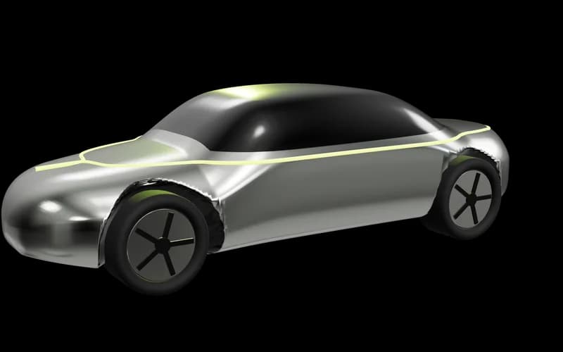
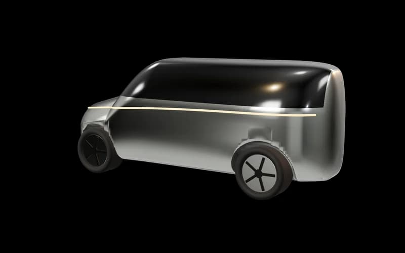
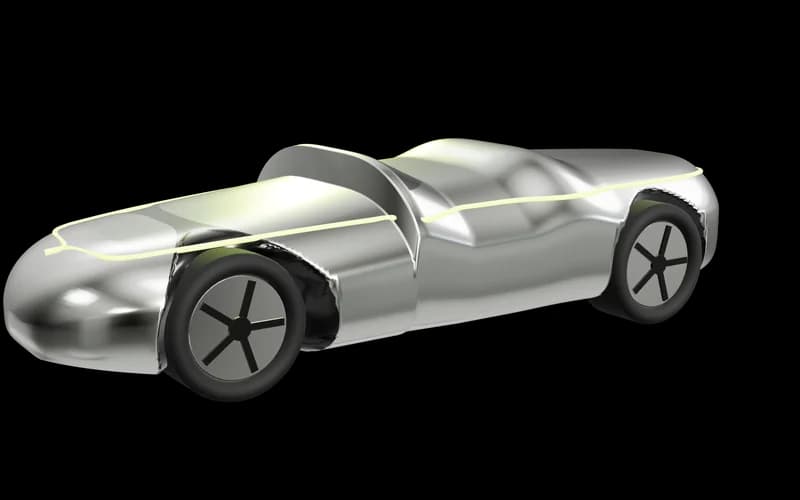
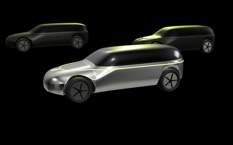
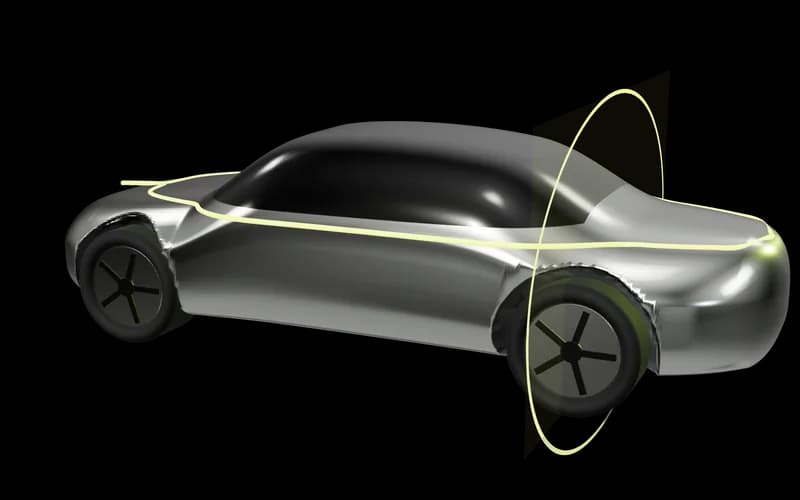
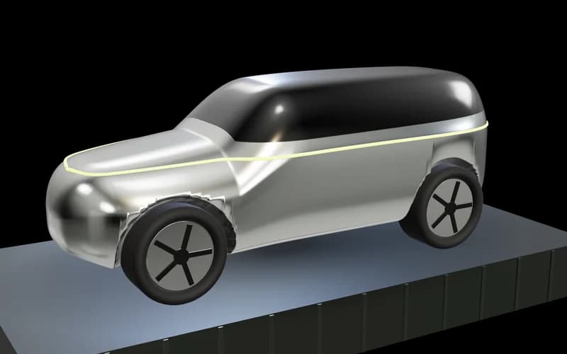
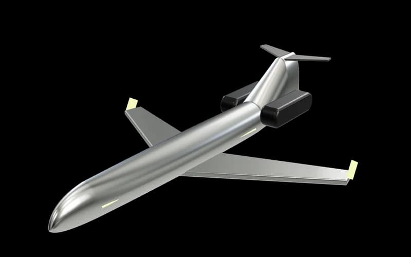
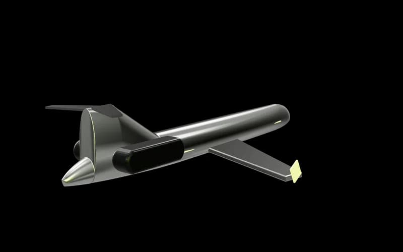
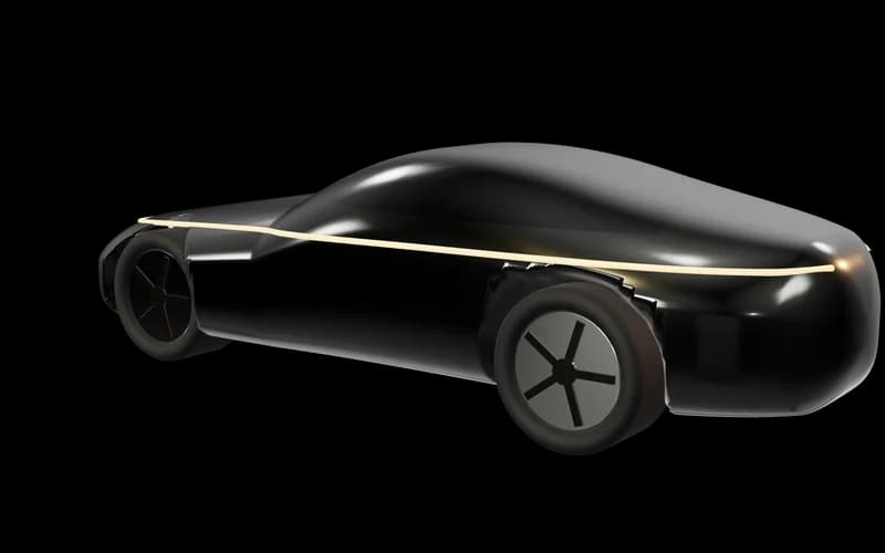
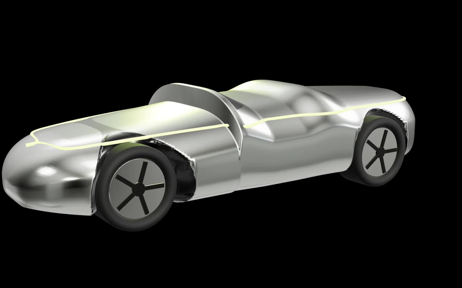
Chrome studio sculptures, single lime signal light, deep shadow
Motion
Slow light sweep, pointer parallax, pauses off-screen
B

Ivory Grand Tour

Editorial, warm, quiet

The Grand Tour issue

Bali by road, Phuket by air.

Read the route
Type
Large serif headlines, generous measure, small caps labels
Imagery
Daylight showroom renders, long shadows, ivory paper
Motion
Minimal — fades and image drift only
C

Signal Velocity

Kinetic, sport-led

GO FURTHER.
RIDE LOUDER.

Find a bike
Type
Heavy condensed uppercase, tight leading
Imagery
Cut-outs on lime fields, diagonal crops
Motion
Marquee type, fast transitions — highest motion budget

Comparison

CriterionA · Obsidian AtelierB · Ivory Grand TourC · Signal Velocity
Luxury signalStrongest — gallery lighting, restraint, material depthStrong — magazine calm, warm and expensiveModerate — energetic, closer to sportswear than concierge
Brand recognitionLime reads as a signal light against obsidian, like the logoLime becomes a highlighter; less iconicLime dominates; risks fatigue and looking like a promotion
Range across servicesEach service gets its own lit world inside one studioExcellent for concierge and buying; weaker for supercarsExcellent for cars and bikes; wrong for concierge and aviation
Legibility & accessibilityAA throughout; care needed with thin serif at small sizesBest reading comfortLime fields need careful text colours; motion budget higher
Build costModerate — studio renders already in placeLowHigher — bespoke kinetic type and motion per page

Recommendation

Build A, with B as the light theme.

A carries the logo's own language — chrome forms lit by a lime signal on obsidian — so the brand is recognisable before the wordmark is read. It stretches across a supercar, a private flight and a concierge brief without changing voice: each service gets its own lighting inside one studio.

B is kept as the ivory theme for daylight reading and for quieter pages. C's energy is valuable in small doses — motorcycle campaigns, social — but as a system it would make concierge and aviation feel like a sale.

Burnt orange has been explored but not chosen. Preview it below; it stays off until you approve it.

Applies to this page only and resets when you leave. Every accent use in the product reads from one token, so a final choice is a one-line change.

See Direction A in the full prototype