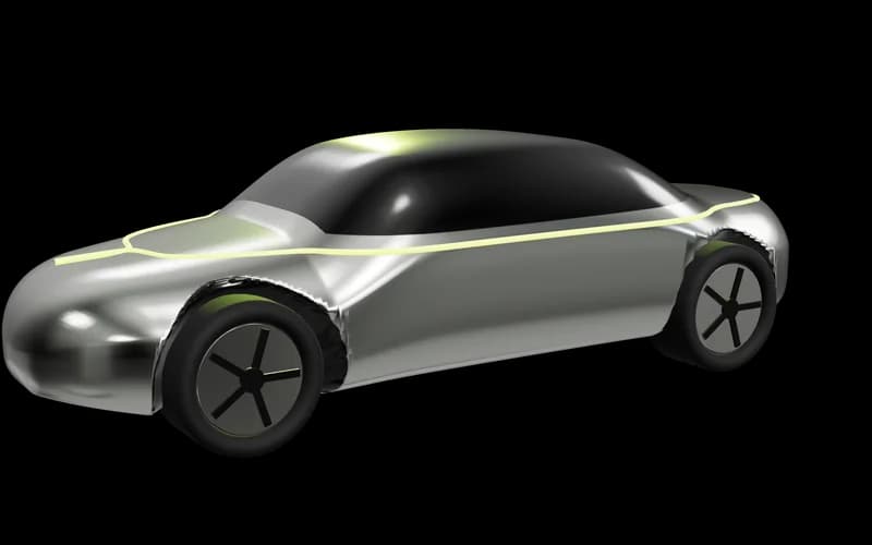
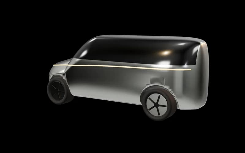
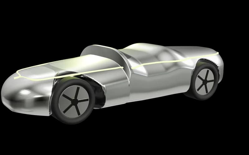
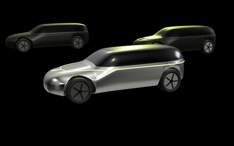
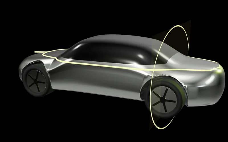
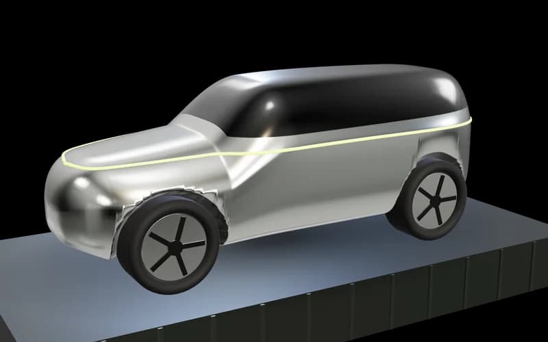
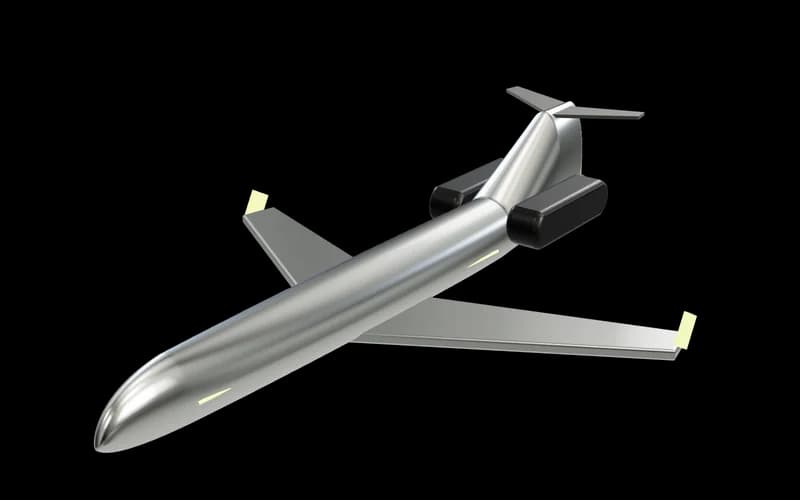
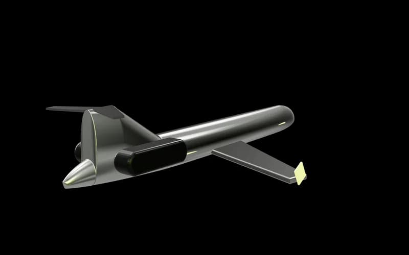
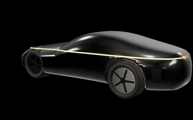
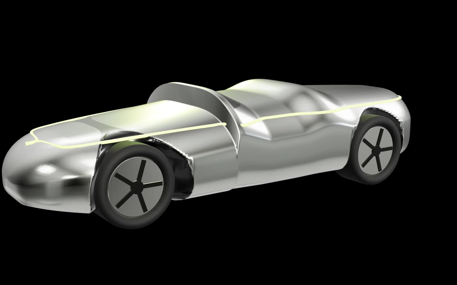
A carries the logo's own language — chrome forms lit by a lime signal on obsidian — so the brand is recognisable before the wordmark is read. It stretches across a supercar, a private flight and a concierge brief without changing voice: each service gets its own lighting inside one studio.
B is kept as the ivory theme for daylight reading and for quieter pages. C's energy is valuable in small doses — motorcycle campaigns, social — but as a system it would make concierge and aviation feel like a sale.
Burnt orange has been explored but not chosen. Preview it below; it stays off until you approve it.
See Direction A in the full prototype →